
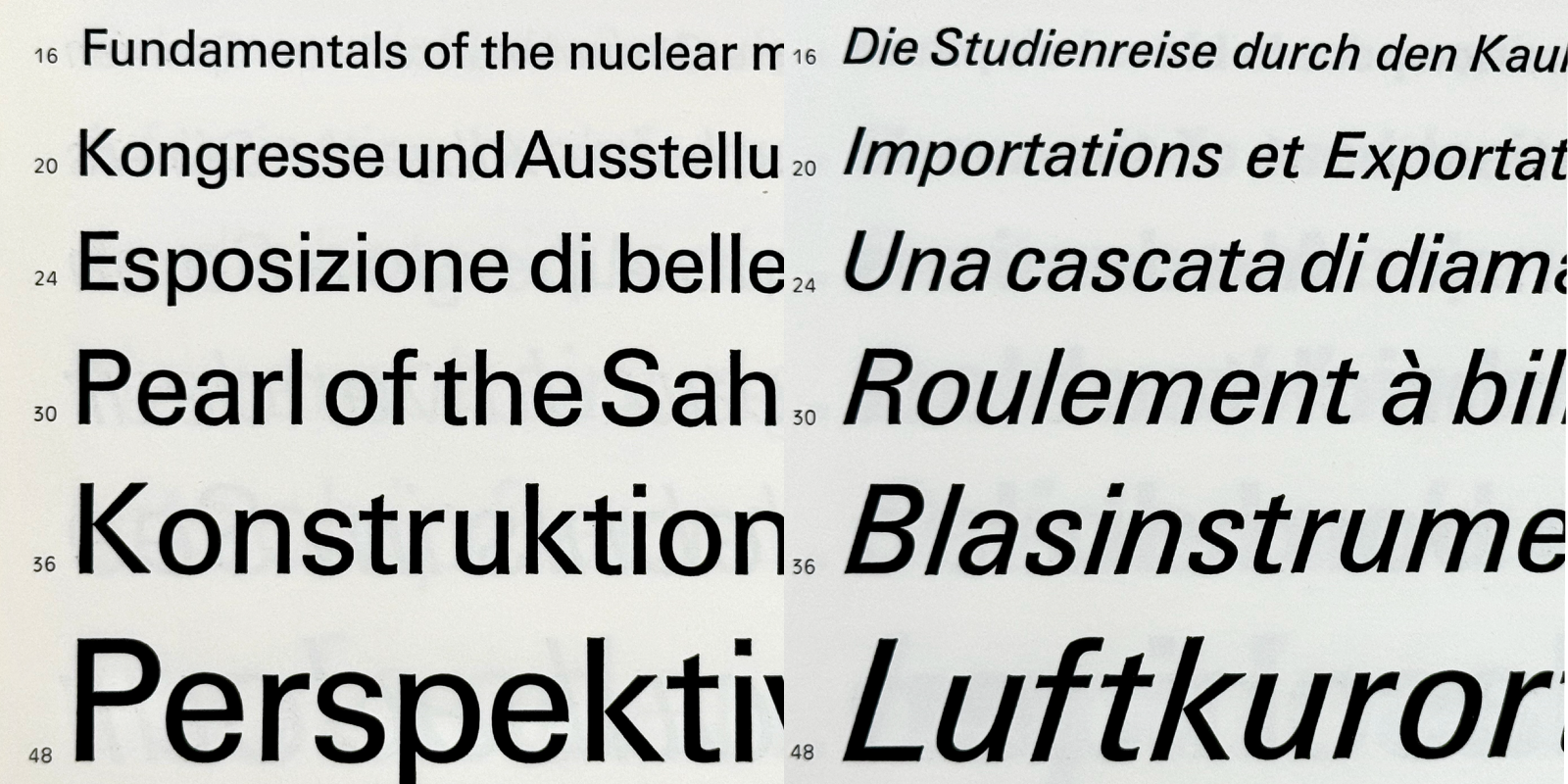
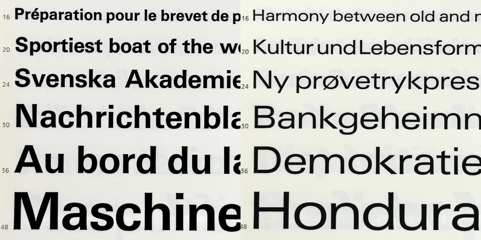
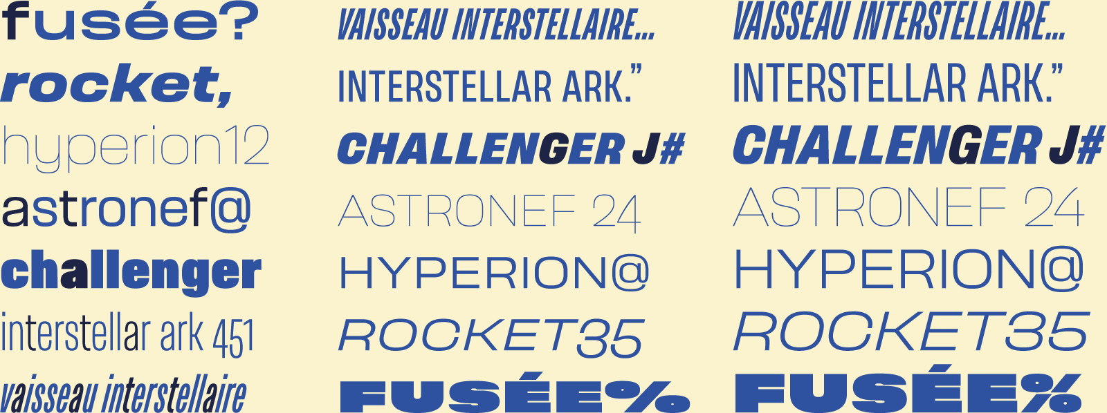
Astronef Base, an ode to innovative type design projects from the 60s. 18 fonts by width, seven widths for a total of 126 styles. Astronef Super is the futuristic display version, available in seven styles.
→ Buy at Typofonderie. → Astronef Base pdf specimen. → Astronef Super pdf specimen. → Download free Try-out versions.
The upsetter influences of Astronef
At the end of 2021, we launched Astronef Super in seven styles, three years later, we launch Astronef Base, a large family of seven widths for a total of 126 fonts. Astronef Base is available in four different atmospheres1: the default version, as well as the Boton, Widmer and Hollenstein tones. These tones pay tribute to these French graphic designers and type designers who carried during the 1960s, a certain vision of modernity in graphic design. Influence that persists in the world of French design.
We refer to Astronef Base in the article as to better differentiate the default version from the Super version, but also as the default version of the Boton, Widmer and Hollenstein tones. Astronef Base actually names the central sub family of Astronef which is neither Compressed, nor Condensed, nor Extended…
The influences of Astronef Base
In the 1950s, two archetypes of a contemporary sans emerged in Switzerland and France. Followed by more Latin-inspired sans in the early 1960s in France and Italy in particular. Let’s go back to these influences, as if to better establish what would define Astronef Base.
Neue Haas Grotesk-Helvetica, a design from the past!
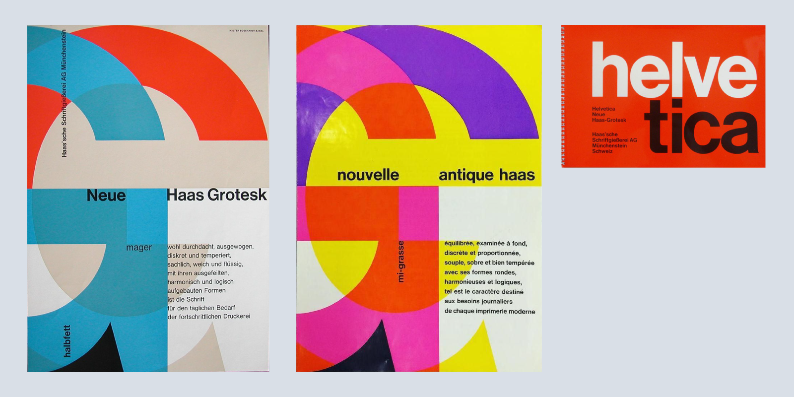
Two covers of Neue Haas Grotesk, Nouvelle Antique Haas specimens created by Fritz Büler, Walter Bosshardt, 1958. Followed by a cover from the Haas Foundry. References 1, 2.
Helvetica Stempel, photocomposition, mid 60s.
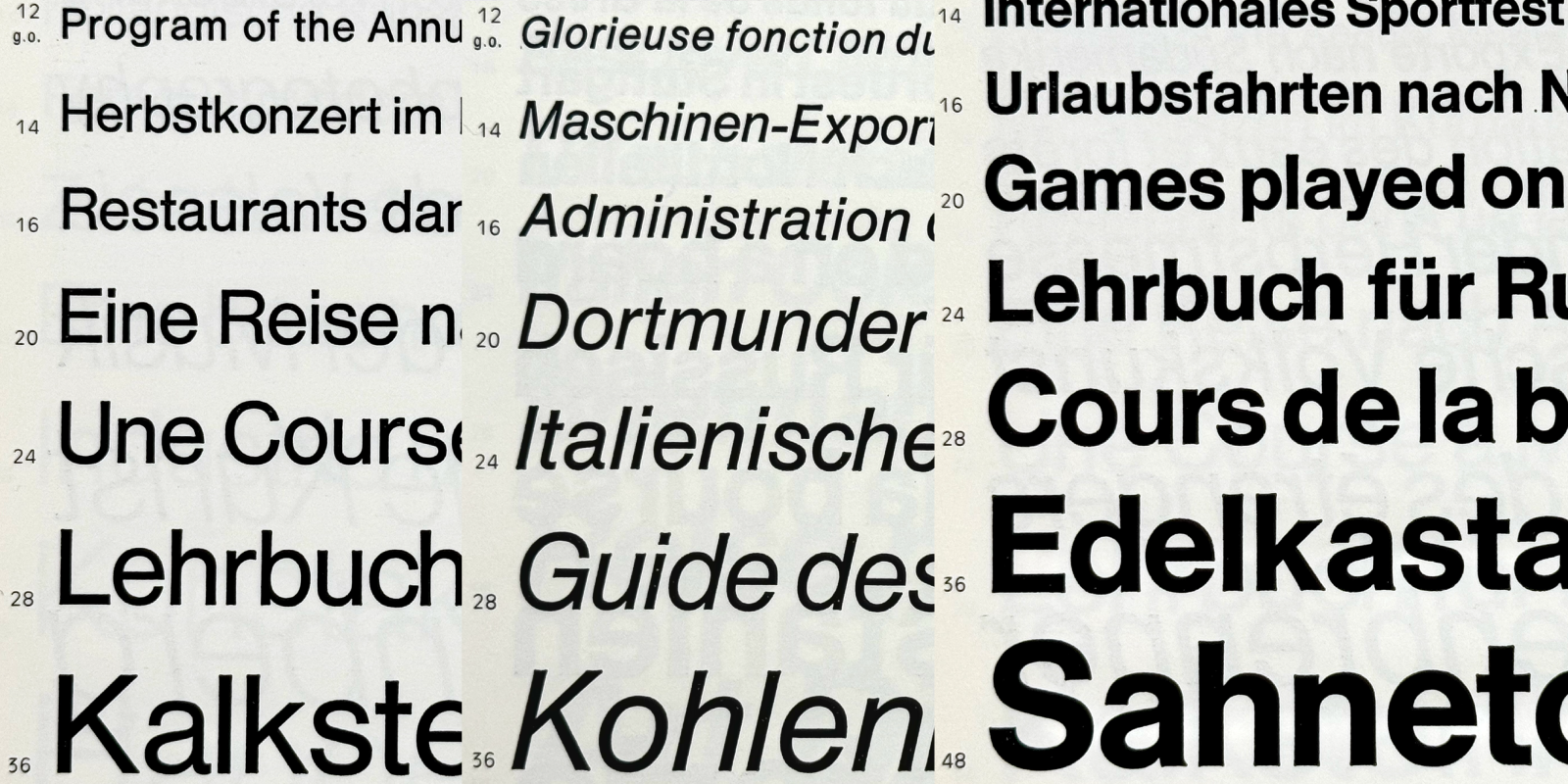
Helvetica Haas France, for manual metal settings, mid 60s.
Nouvelle Antique Haas, Marcel Lagrue Foundry, France, early 1960. Antique is the French name for Grotesk. Antique was the name used in the Thibaudeau classification for sans.
Neue Haas Grotesk, imagined by Eduard Hoffmann, designed by Max Miedinger as part of his work at the Haas Foundry, may be considered a conservative approach to the linear. Indeed, Neue Haas Grotesk, marketed in France under the name Nouvelle Antique Haas, is most often described as a typeface influenced by Akzidenz-Grotesk published by Berthold in 1898. At its release, Neue Haas Grotesk was initially a small family of four series for manual metal composition at Haas’sche Schriftgiesserei (1957). Renamed Helvetica, three years later when licensed by Stempel, then at Linotype, which adapts some styles for its machine. It was during the 1960s that Helvetica became a large family, available in many systems of compositions that will ensure the success it knows. Its adoption by many visual identity programs from Germany to the United States in the period of the 1960s and 1970s confirms its influence in the field of graphic design. Nowadays, Haas Grostesk2designed by Christian Schwartz from 2004 and published jointly by Linotype and Font Bureau in 2011 is a real success in terms of design. More recently Monotype Studio has published Helvetica Now, directed by a team led by Charles Nix, which they define as follows: “This is not a revival. This is not a restoration.”3
Univers, a major industrial and technological design project
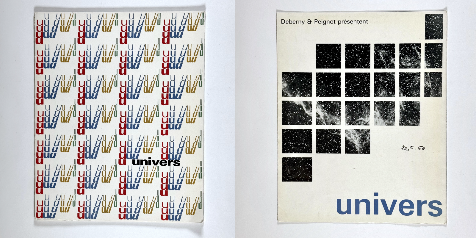
Univers specimen covers, Deberny & Peignot Foundry, designed by Remy Peignot, 1956–57.
Spécimens Univers, Deberny & Peignot Foundry, designed by Remy Peignot, 1956–57.
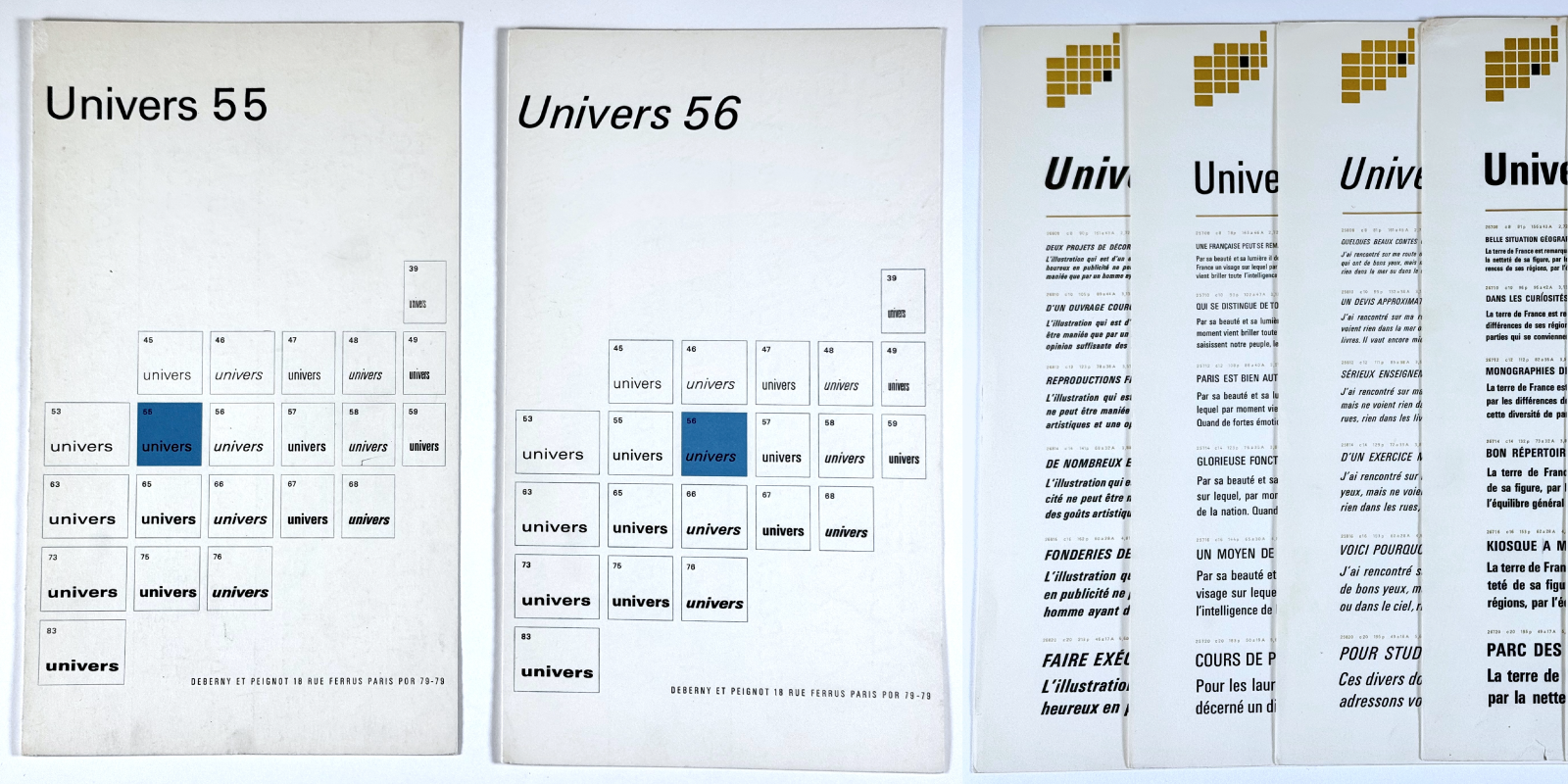
First diagram of Univers in 21 series, around 1955. Bromide reproduction offered by Adrian Frutiger to the author in 1990.
Univers Stempel, photocomposition, mid 60s.
Univers Haas France, manual metal type setting, mid 60s.
Univers, Marcel Lagrue Foundry, France, early 1960. Note the detached cedilla, with a drawing close to an inverted comma.
Tests and corrections of Univers. Sources Atelier Villa Moderne, Arcueil, 2018. References 1, 2.
Cutting tests on film, typically used in the process of transfer letters. Sources Atelier Villa Moderne, Arcueil, 2018.
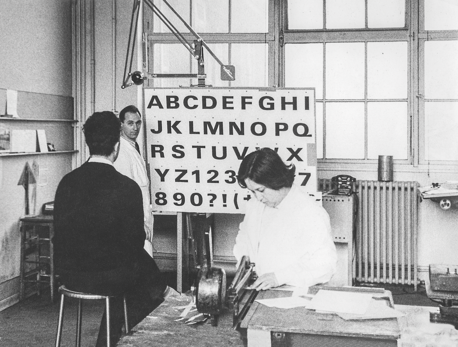
In Deberny & Peignot’s workshops in Paris, Ladislas Mandel presents to Adrian Frutiger a stage in the drawing of Univers 83. To the right Lucette Girard. Photo by Albert Boton.
As Adrian Frutiger4explains very well with a touch of humor, “Helvetica is the jeans, and Univers the dinner jacket.” Then art director at Deberny & Peignot,5Adrian Frutiger from 1953–54 conceptualize his Univers in 21 series. It is an innovative designer project, systematic in its conceptualization and innovative in the desire to offer a contemporary sans, which adapts to all situations and topics. This project of Univers is titanic. In this, his management will have required many human resources (Deberny & Peignot was recruiting many designers at that time including Ladislas Mandel who became workshop manager or Lucette Girard, then the young Albert Boton) and technological resources, the result is worthy of these great contemporary industrial design projects. Univers was designed to be immediately available in the new Lumitype photocomposition machine marketed at the same time by Deberny & Peignot (1957), in manual type setting composition (35,000 punches) and in Monotype metal composition system from 1959.
The design of Univers is based on humanistic proportions, both in uppercase and lowercase, some letters being wider or narrower than others. Many stylistic details of the historical sans have been simplified by Adrian Frutiger, who erased these 19th century remains, such as the low ending deleted and his design based on a round shape that attaches horizontally in the middle. The G, R and Q are simplified, the ending of the y too, the diagonal letters such M, N, U, etc feature a constrast influenced by writing ductus. The different weights and widths are organized in a rational way, using a system to define each instance: 55 for regular, 56 for italic, 65 for bold, etc. Univers in its initial design remains more interesting, more delicate than the various recent optimization attempts.
Brasilia, the modernity of the 60s
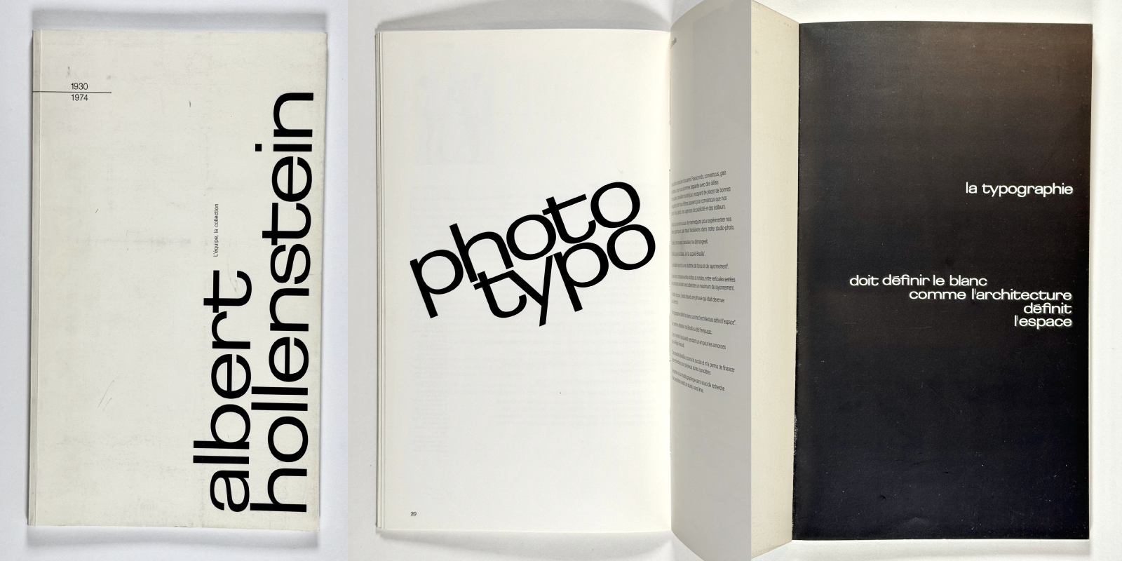
Albert Hollenstein exhibition catalog, Ecole Estienne, 1994. The titles are set in Brasilia redesigned by Albert Boton for the occasion, because no more sources identified from the original designed by Albert Hollenstein and him.
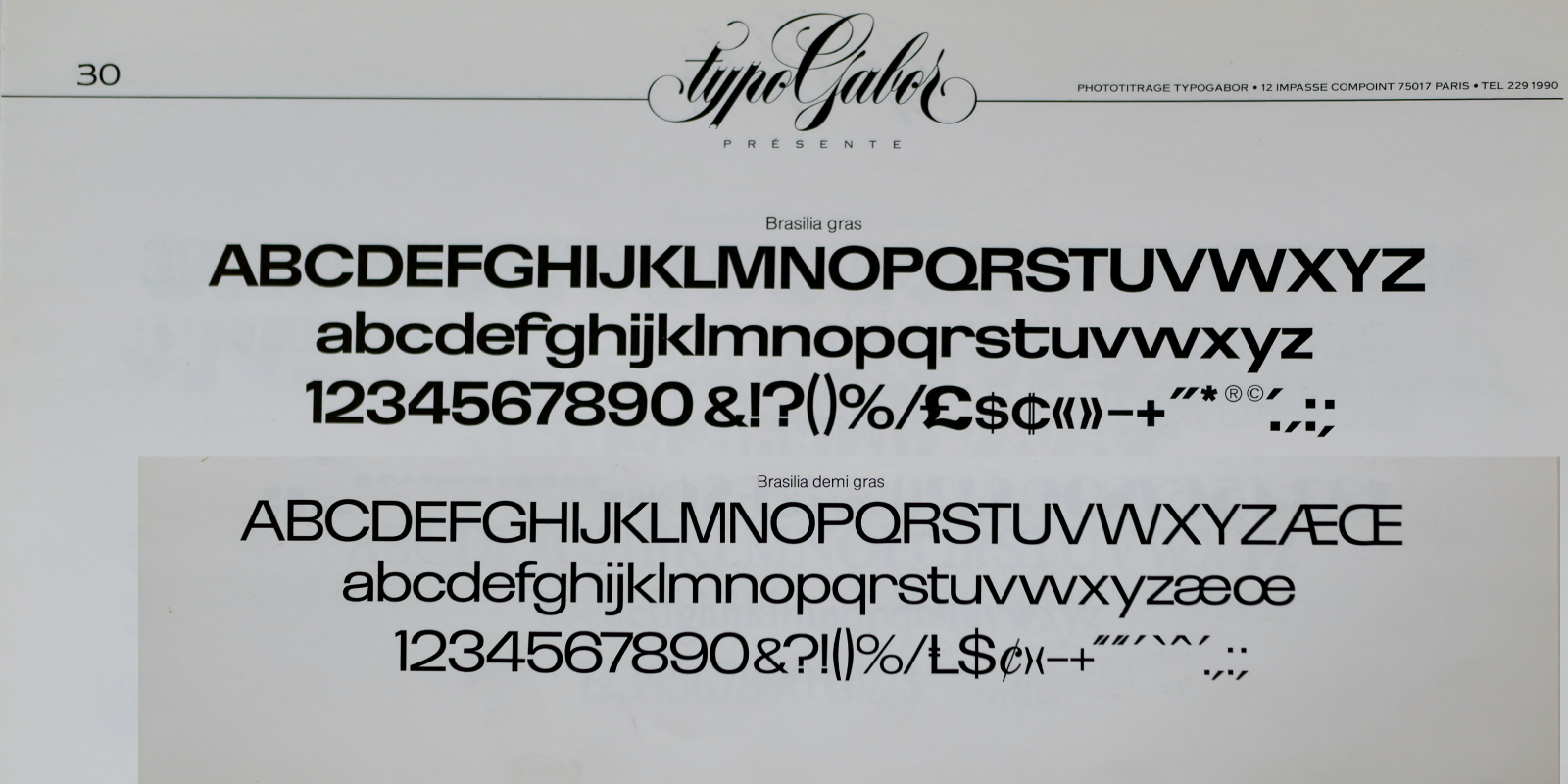
Excerpt catalog Typogabor headlines collection that distributed Hollenstein Phototypo typefaces, including those of Albert Boton, in the late 1980s. References 1, 2.
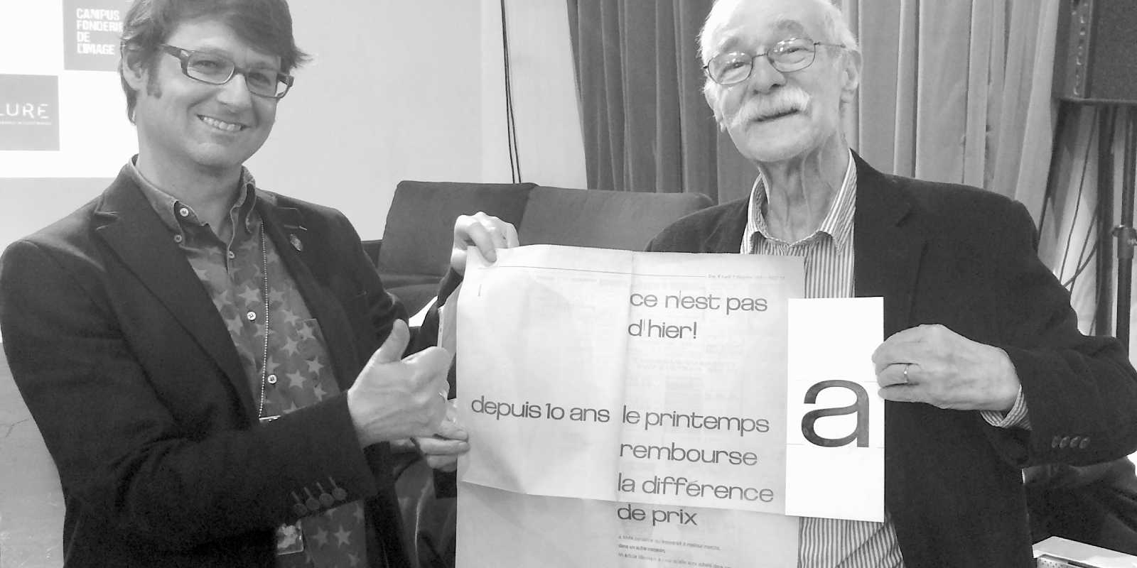
Albert Boton presents the a of Brasilia, during the Puces Typo (at his side the author of the article), as well as an old advertisement for the Galeries Lafayette set in Brasilia. The art directors of the Galeries Lafayette being in the 1960s, Peter Knapp and Jean Widmer.
Albert Hollenstein6who arrived in Paris from Switzerland in the early 1950s, was a representative of the Haas foundry in the early 1960s, and was the first to distribute Helvetica in France. The latter, accompanied by the Frenchman Albert Boton7– who was in the team to draw the condensed series of Univers – drew a sans in filiation with Univers, which they called Brasilia in tribute to the Brazilian architect Oscar Niemeyer. Brasilia (started in 1958) is an antithesis of the established current of a Helvetica that would like to be “transparent” and utilitarian. The curves, proportions, details such as the f, t and y of Brasilia are immediately recognizable, and bring a unique personality. And also, as Albert Hollenstein explains: ”The play of contrasts between straight and round, between tight verticals and wide openings wants to achieve maximum radiation.” From its launch it is a success: the advertiser Pampuzac (at Publicis) makes it an exclusive acquisition for one year for Renault advertisements. It becomes the wordmark of the couturier Courrèges (who launched the Space Age Fashion in 1964), of the Fnac store chain, these uses will help make Brasilia iconic. It is for these reasons that House Industries refers to it for its typeface created by an invented character René Albert Chalet.8
The Novaresian vision of sans serifs
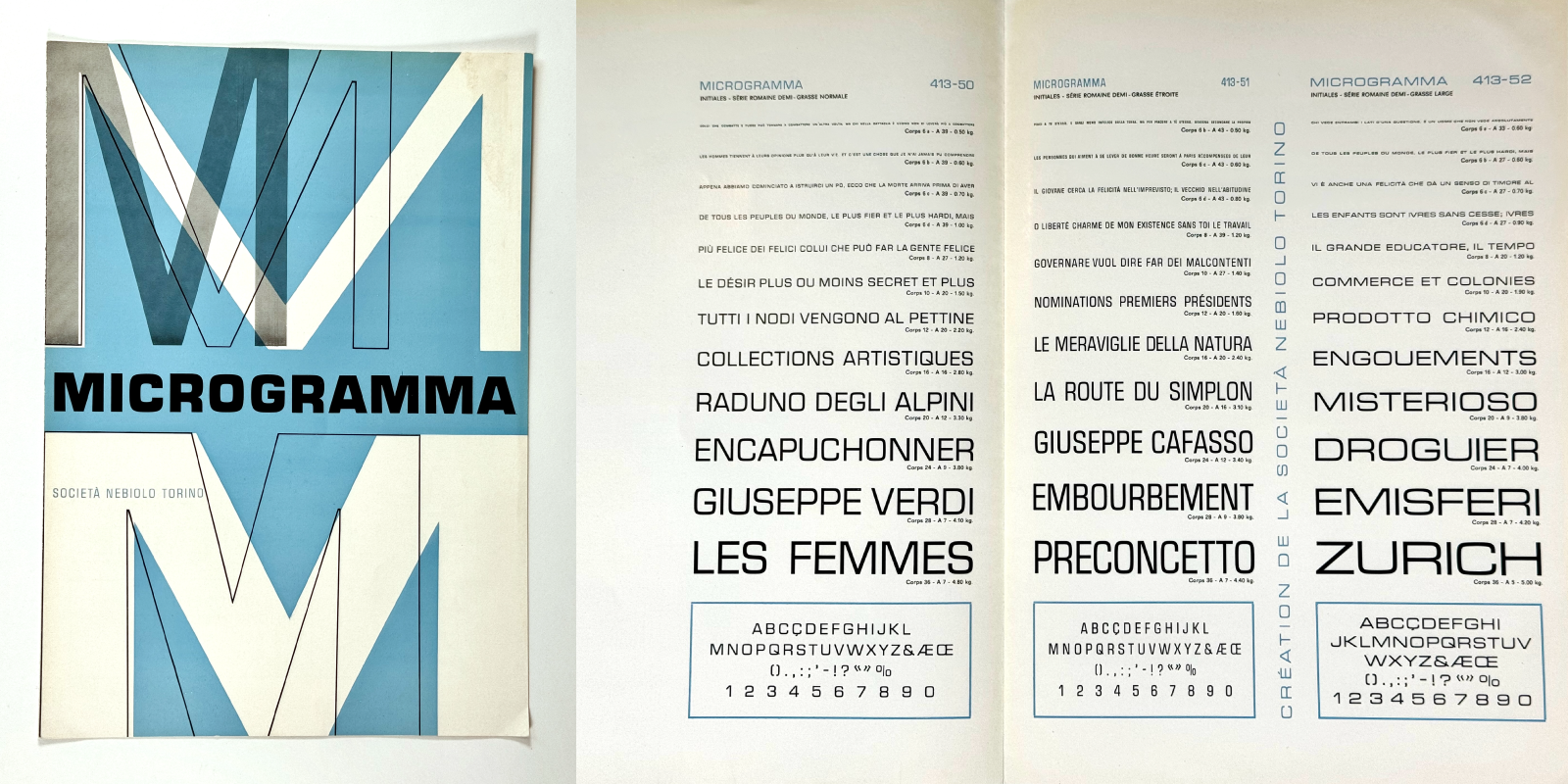
Microgramma specimen, Fonderie Nebolio, 1951.
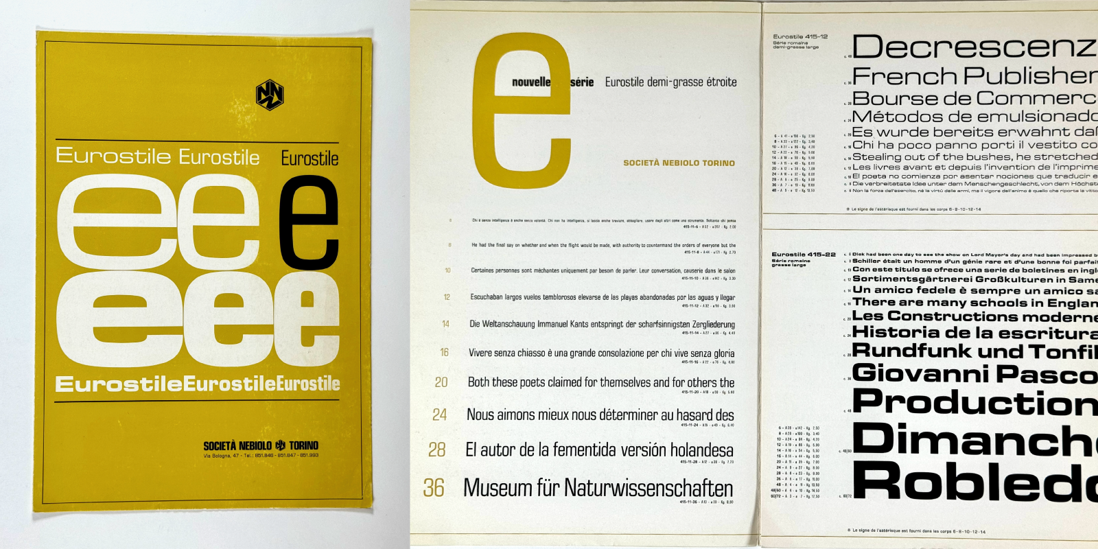
Eurostile specimen, Fonderie Nebolio, 1962–68.
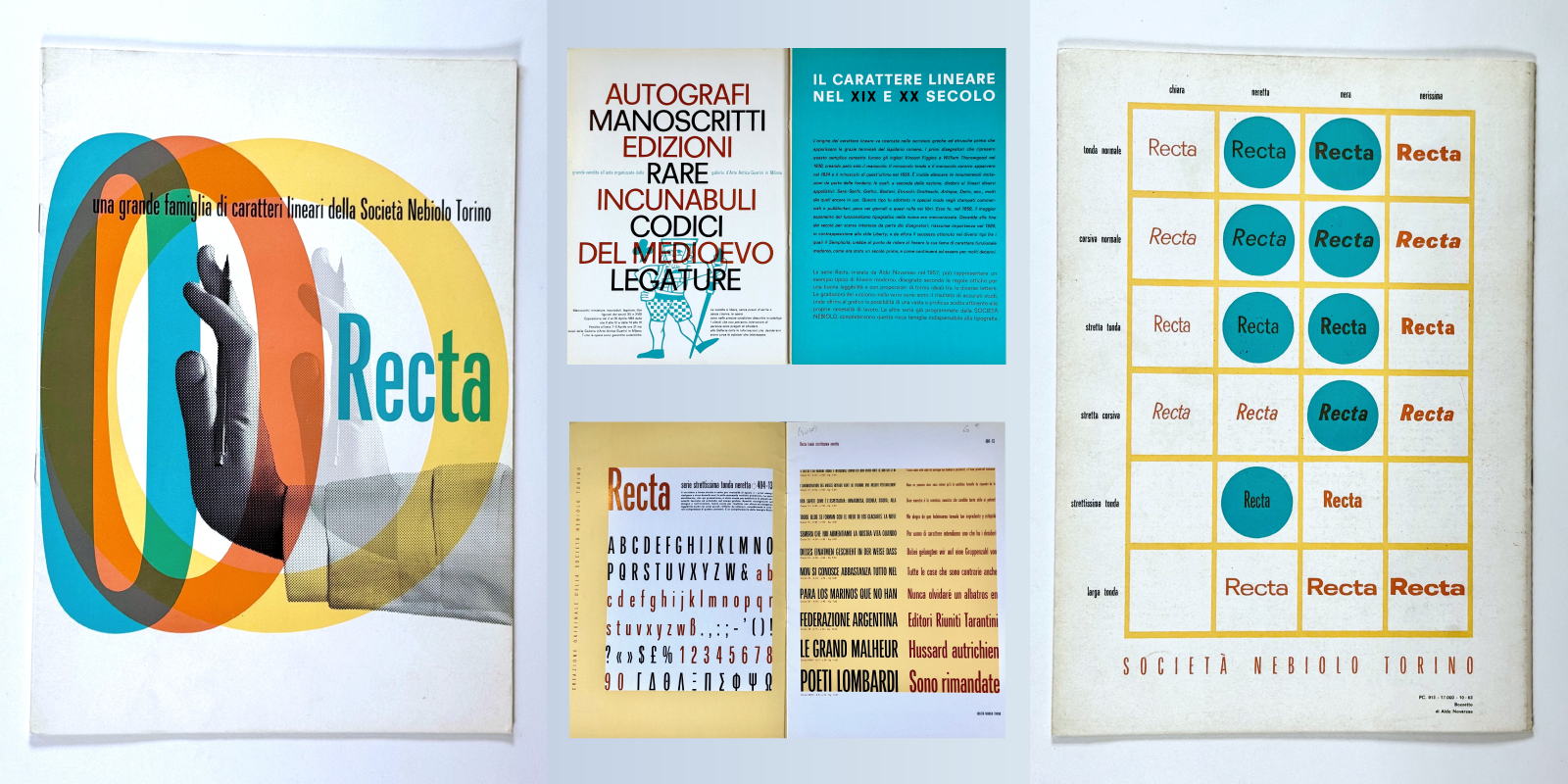
Recta specimen, published by the Nebiolo foundry, 1958–63. The designer’s hand pushes the letters suggesting the flexibility of the type family system by showing three different widths, each characterized by a different color. Reference 1.
The typefaces Recta, Forma, or Eurostile by Aldo Novarese9(“Aldo Novarese is one of the often-overlooked maestros of 20th-century type design” say Paul Shaw) represent this more Mediterranean and living vision of the sans. The art director of the Nebolio foundry,10Alexander Butti’s successor, will have taken risks throughout his career, in his assertive design choices. Recta released in 1958, is culturally closer to Univers than Helvetica: humanist proportions, simplified forms, with the difference that Recta is rounder in its design. You will notice that Recta Strettissima (Ultra condensed) does not have its totally vertical round letters straight, but slightly in tension, this detail was already an inspiration for Arteria Compress.11 Eurostile, published in 1962, is based on its predecessor Microgramma (only in capitals) designed by Alexandro Butti assisted by Aldo Novarese, is certainly more rectangular than the others, but there are in the lowercase stylistic choices similar to those of Brasilia.
The drawing of Astronef Base
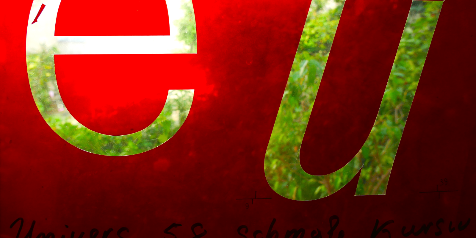
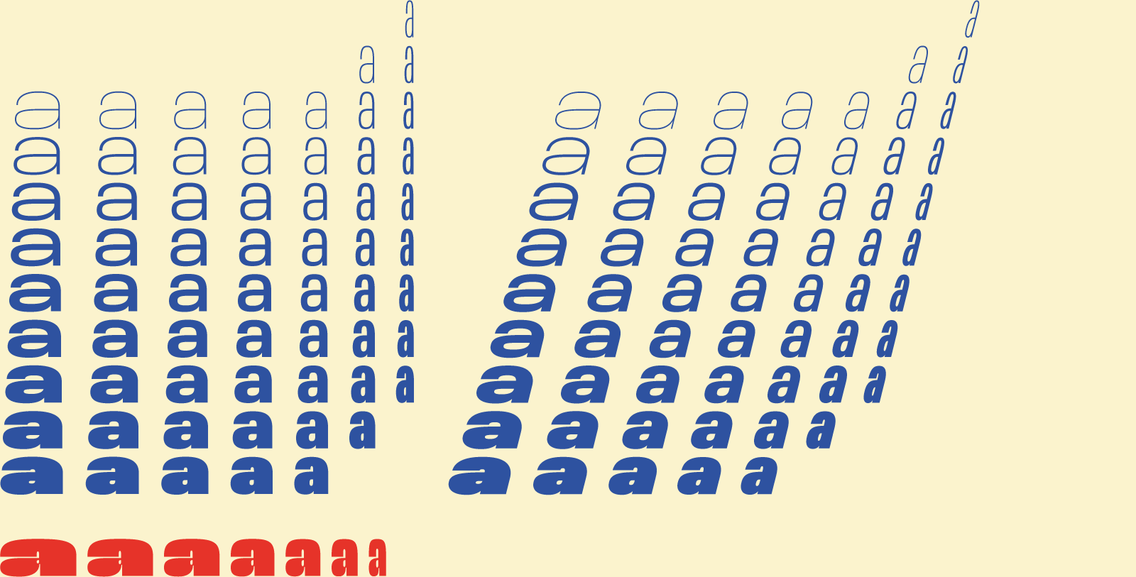
n in Astronef Compress, Condensed, Narrow, Base, Large, Wide, Extended comparés.
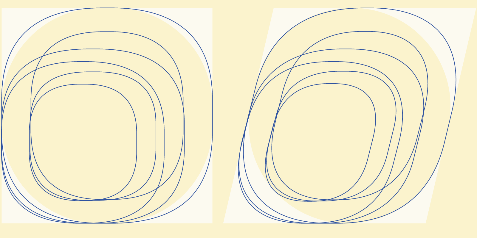
The drawing of the o in lowercase, small capitals, capitals of Astronef Large is neither rectangular nor round, it is between two.
In recent years, we have seen the appearance of sans that claimed a Swiss-Germanic inspiration from the 1950s, often very direct tributes, some close to Helvetica, others to Akzidenz-Grotesk and its variants.
The design of Astronef Base12is not inspired by this or that sans, even less designed from existing sources, nor impacted by the charming references of the 19th century. Its style is rather influenced by a way of working of some type designers of sans such as Adrian Frutiger, Albert Boton and Albert Hollenstein and their vision: notion of system, non-mechanical fluid curves, search for contemporary, non-past forms.
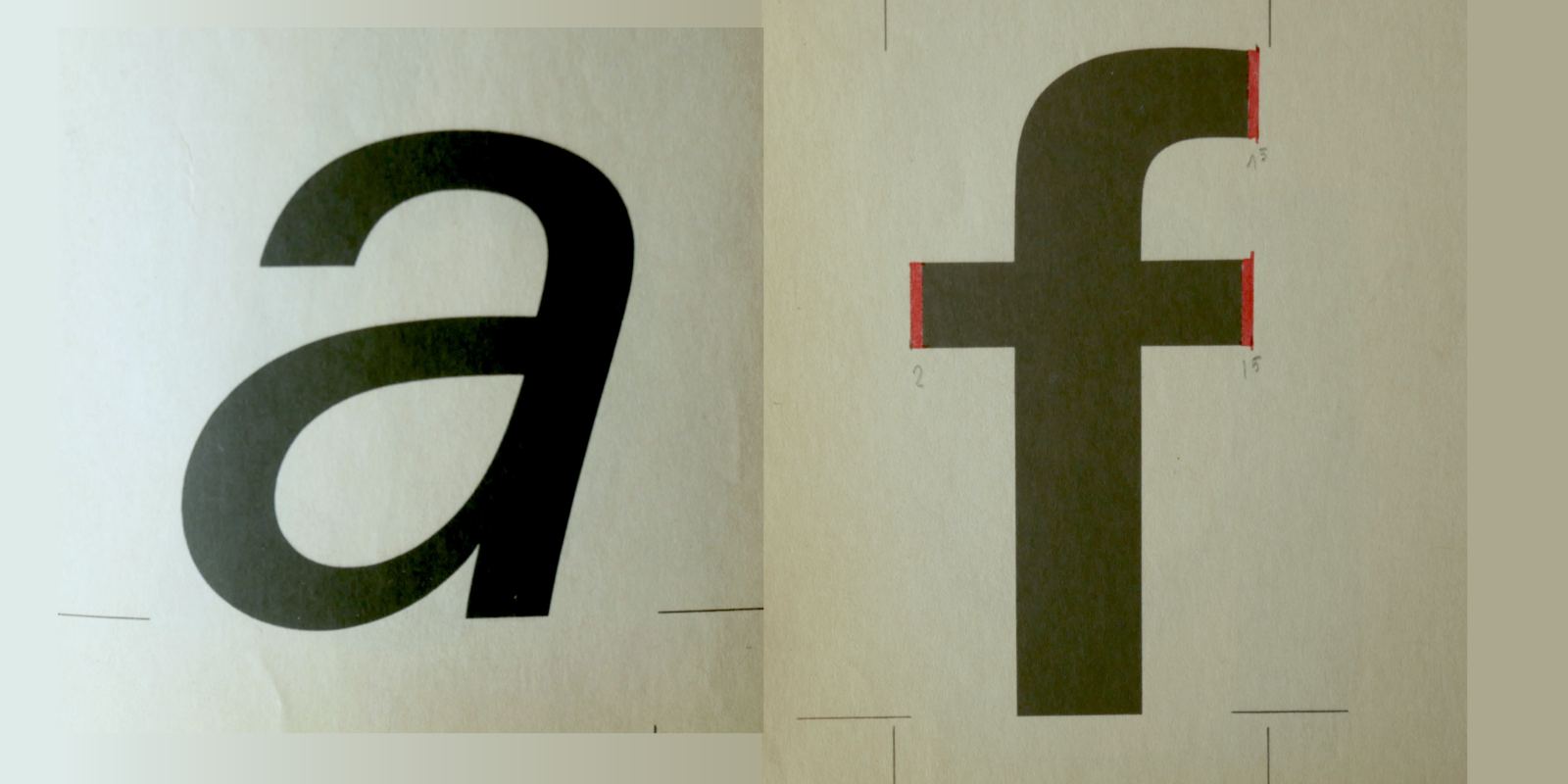
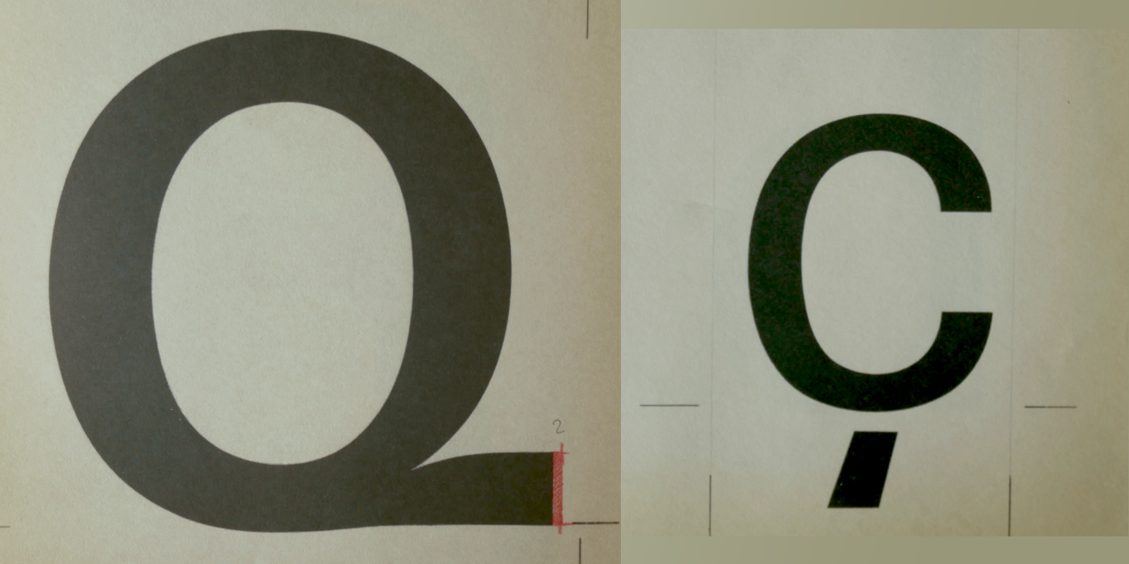
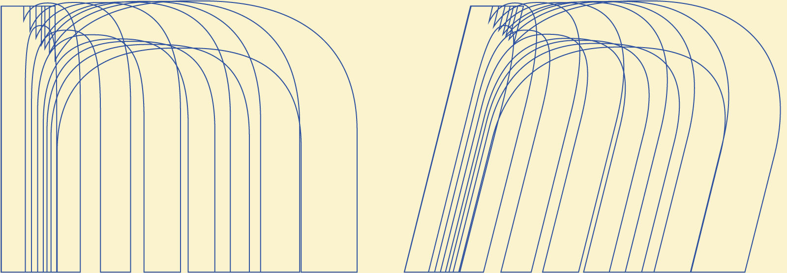
Astronef Base could be seen as a fluid almost rectangular linear in the transition of the shoulders-stems to the top and bottom curves. See, for example, the way the n are drawn. The transition between the branch and the 2nd stem is fluid, in a ogive shape in order to bring a dynamic.
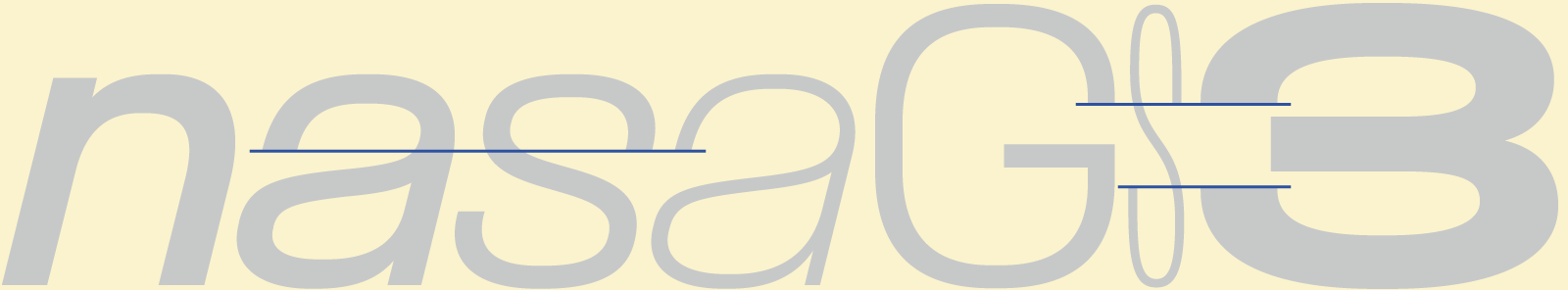
The other great principle of Astronef Base is to be more radical, more assertive in certain design choices. It is a stylistic differentiation that brings a novelty to users, in order to try to escape this wave of sans that are similar. The counterforms are excessively closed, but the alignment of the endings is compatible between letters, weights and widths (except in some cases in extreme weights): the endings of a, s, c are all aligned. Everything is done to mark headlines, visual identities that is close to a custom lettering. In capitals, the S and G align, the C in some weights and widths. Same for numerals, monetary figures. This necessary alignment work will have been very complicated to plan since 2021, and to maintain consistency almost everywhere. Until the month before the launch, revisions and optimizations of the alignments were carried out.
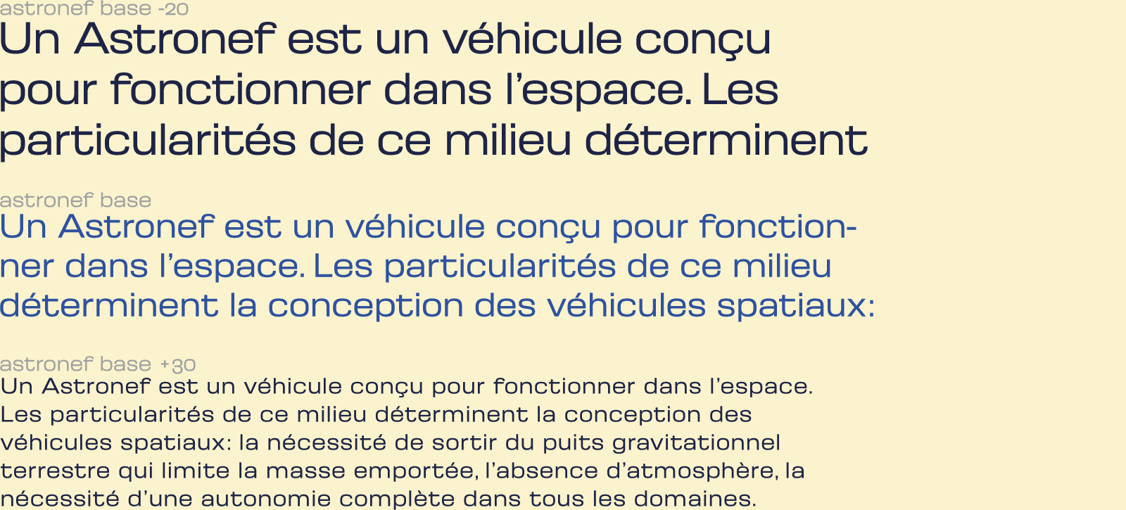
Spacing is relatively tight, ideal for composition in intermediate sizes. In a small sizes, adding +30 improves the clarity of the text. In very large sizes, re-tightened to -20 accentuates the visual impact.
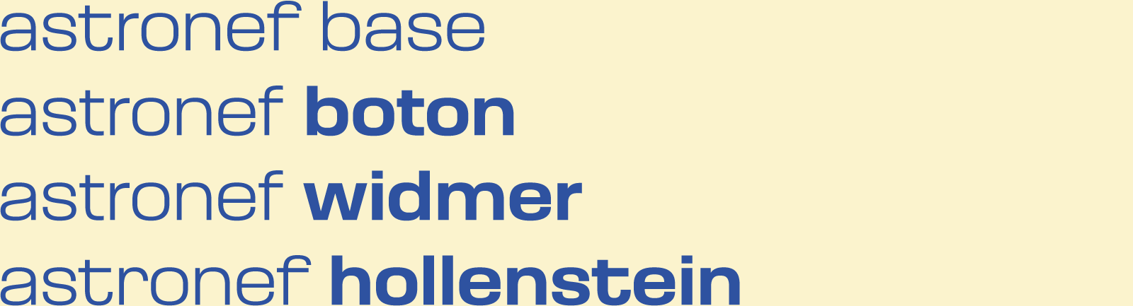
The 4 different tones of Astronef Base: from the default “Base” version to Boton, Widmer and Hollenstein tones, as well as Astronef Super family are there so that Astronef can adapt stylistically to a particular art direction.
Each of the names of the tones of Astronef Base are there to pay tribute to these Swiss established in Paris and French who each in their own way have built an approach to new design in France, which will have made many followers in the way of teaching graphic design (Rudi Meyer and Peter Keller13arrived a little later from Switzerland were talented discoverers) and in the contemporary practice of graphic design in France from the 1960s.
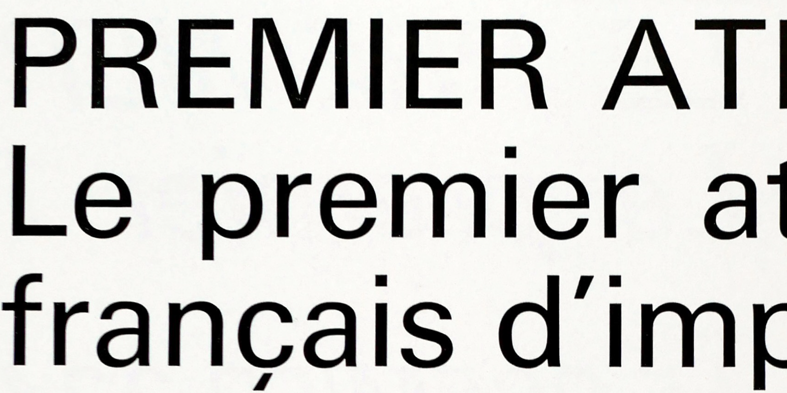
Astronef Base
With its default features, choosing it for logotypes, titles, Astronef Base is immediately identifiable. The combination of f, t, y, G, J, R brings a special touch, particularly attractive in very narrow and very wide widths. The default version could have been called Astronef (Aldo) Novarese to pay tribute to his talent, a designer who has always taken risks in his choices. And also of course because of the distant filiation to certain details of Eurostile and Microgramma.
Astronef Boton
Astronef Boton is the most sober version, the one that will highlight the content, without graphic artifices. But why this name Boton? Albert Boton (1932–2023), was a French type designer who started his career at Deberny and Peignot by working on Univers alongside Ladislas Mandel and Adrian Frutiger. In the early 1960s, he joined Albert Hollenstein (1930–74, originally from Switzerland, who had a career in Paris) to finalize Brasilia. Of a calm nature, calm, excessively humble, but not devoid of humor, Albert Boton, often spoke of stylistic rigor, of a design that knows how to be discreet in its expression. He said he was a craftsman of the letter. It is because of Albert Boton’s admiration for Adrian Frutiger, that Astronef Boton is probably the most Universe version of the 4 versions. Astronef Boton tone is also the initial family version, which was started in 2018 as a visual identity project for the Paris 2024 Olympic Games.
Astronef Widmer
Astronef Widmer is the “most” Helvetica tone of Astronef, especially not the combination of a, G and R. Jean Widmer (1929- born in Switzerland, arrived in France in the 1950s) will have left his mark on French design by revisiting in particular the signage of public places and road infrastructure for a purpose that is both practical and aesthetic. His posters for the Centre de création industrielle14who will join the Centre Pompidou are a typical example of a sculptural vision of design, he had used Helvetica. One of the first in France to make typography a central element of his graphic design practice. In this, he will have imposed this approach to Swiss typography in France in many visual identity projects in the public sphere: Museums, French institutions, etc.
Astronef Hollenstein

Albert Hollenstein (1930–1974), born in Switzerland and arrived in France in the 1950s at the same time as Peter Knapp, Jean Widmer, Adrian Frutiger, began his career by importing Neue Haas Grotesk in France as a Haas agent. But very quickly, he experiments with the fields of graphics and typography. He will launch his graphic studio, and Hollenstein Phototype, a “type foundry”, particularly focused on display typefaces, including those of Albert Boton. Astronef Hollenstein tone is a strong tribute to Brasilia, designed by the two Alberts. Indeed, the assembly of a, f, r, t y, as well as the R are a direct reference to Brasilia.
Astronef Super
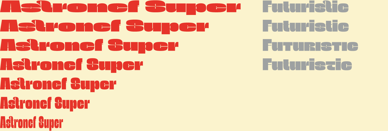
Astronef Super is the “Spin-off” of the Astronef Base that borrows from the charm of retro-futuristic universes. It is deliberately excessive in its stylistic choices, because its glyphs are intended to be remixed, mixed through its variants.
Without concessions, and even radical, Astronef Super declined in seven styles, pushes the limits of weights to the strongest, systematically while preserving a unique design. The capital and lowercase forms mix because they are declined both on the heights of the capital and lowercase positions, in the manner of the “unicase” alphabets. The OpenType features from Soft to Peignot Style, up to a slightly crazy Remix, which mixes everything, allows you to easily change the look of a text.
Conclusion and thanks
It was in October 2018, as part of a competition alongside W Conran Design, concerning the Olympic Games for Paris 2024 that I started a typeface in multi-widths and weights. It is in 2020 that Astronef Base project will develop over a period of 4 years. The idea of designing the Astronef Super published in 2021, is in reaction to the Astronef Base, which did not seem extreme enough. As a result, the most heavy weights of Astronef Base will be fattened afterwards.
I would like to thank15 Joachim Vu, Benjamin Blaess who participated in the development of the first project in 2018. Then from 2020, Élodie Tourbier, but especially Léo Guibert without whom the final project and its multiple masters, the management of alignments, the many optimization phases could not have been carried out. This minisite and the promotional design elements were designed by Élodie Tourbier, Ferdinand Del Fabbro.
The glyphs set of Astronef Base and Super follows the usual requirement at Typofonderie: small capitals, four sets of numbers, including a set of numbers of widths harmonious with the capitals, fractions, superiors, ligatures, variants of glyphs, dingbats, etc.
You will have understood, the 126 fonts of Astronef Base in its four tones and the 7 fonts of Astronef Super form a rich offer of typographical surprises that will be pleasant on a daily basis!
— Jean François Porchez
References
We take up this idea of different atmospheres in the same typeface family as for Parisine Plus in 1999, Aiglon in 2022, Arbale in 2023.
2Neue Haas Grotesk’s original development in the 1950s is a story of collaboration and creative marketing, by Indra Kupferschmid, 2011.
3Just how neutral is Helvetica?, Monotype.
4“I was fortunate. Early in life, I understood that my world was a two-dimensional one. At sixteen I knew that my work would be in black and white”, by Yvonne Schwemer-Scheddin, no. 31 vol. 8, 1999.
5The rich diversity of Deberny et Peignot specimens, Typofonderie Gazette, 2013.
6Albert Hollenstein: Typographe Audio-visualiste, by Gérard Blanchard, Communication et Langage, 1974.
7Albert Boton’s colorful world of black and white, by Thierry Fétiveau, 2013. Albert Boton, presented by Olivier Nineuil, Ypsilon, 2011. Albert Boton (1932–2023), @Typofonderie, 2023.
8Chalet: typefaces in three unique styles is the creative genius of acclaimed clothing designer René Albert Chalet.
9Alfa-Beta, Aldo Novarese, reprint, Archivio Tipografico, 2020. Biography Aldo Novarese, Archivio Grafica Italiana.
10The Nebiolo legacy, Eye Magazine, no. 102 vol. 26, 2021.
11Arteria Compress, a compressed display typeface inspired by Italian shop signs & woodtype tradition, Typofonderie.
12There is another Astronef in the form of an abecedarium, draw by Jean Alessandrini, around 1976.
13Rudi Meyer about Peter Keller, Typofonderie Gazette, 2010.
14Affiches pour le Centre de création industrielle (CCI), Jean Widmer, 1969.
15